Society Of Salad
Where Mindful Eating Meets Everyday Joy
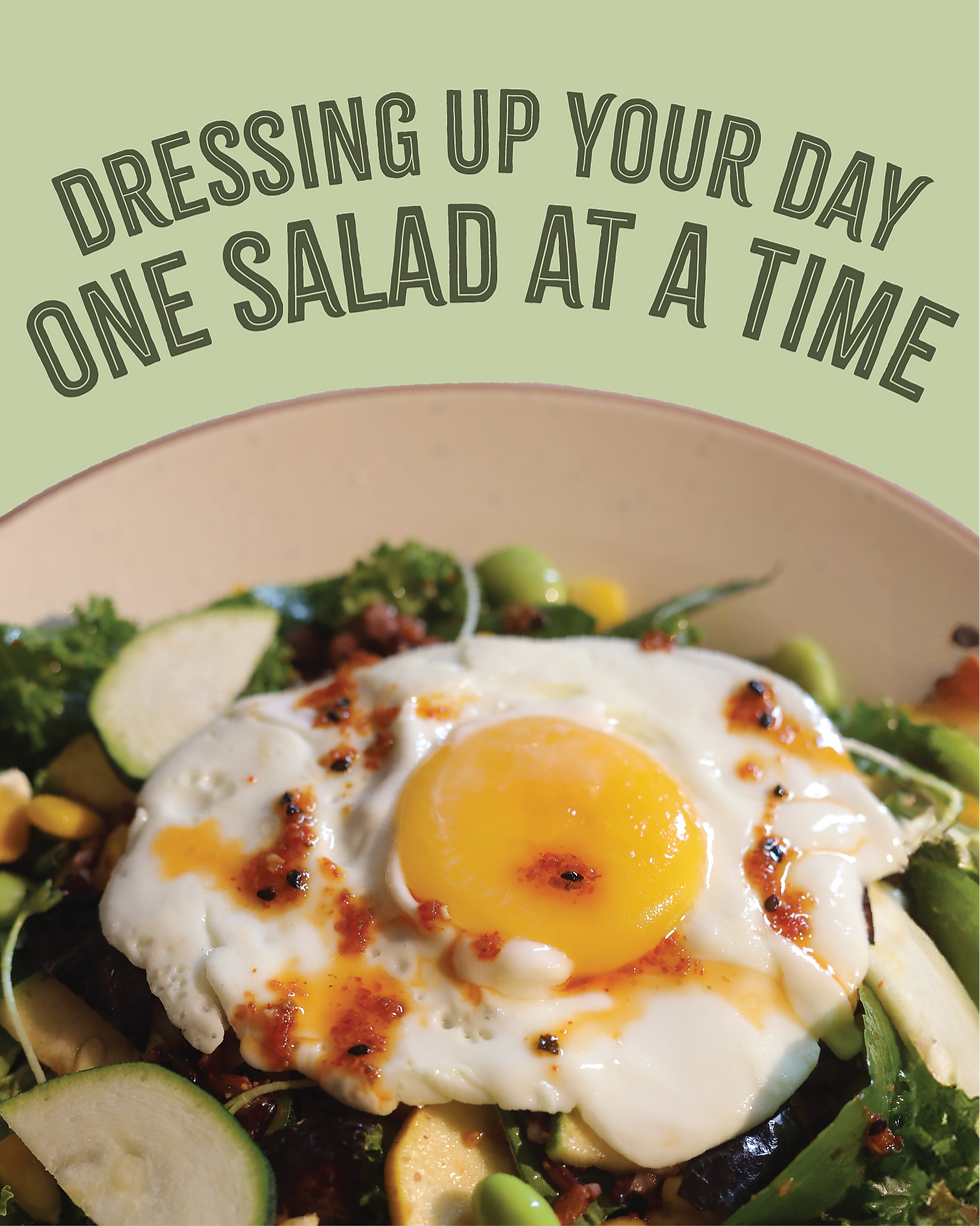
Welcome to a vibrant space where clean eating is more than just healthy, it’s exciting, inclusive, and full of flavour. Every meal is crafted to energize you, nourish you and bring a little joy to your day. This is more than just a place to eat, it’s a community built around mindful choices and feel-good food.
Society of Salad is a reimagined café brand created for the DS Group, born from the need to move beyond UnCafe’s ambiguous identity. The project set out to build something with clarity, purpose, and personality - a space that feels vibrant, inclusive, and as fresh as the food it serves.
UNCAFE lacked clarity and connection. The rebrand focused on creating a clear identity, a name that reflected its purpose, a fresh design system, and a voice that built community. Repositioning it as a vibrant, inclusive space for clean eating.

Naming
We needed a name that captured the spirit of the space fresh, fun and inclusive.
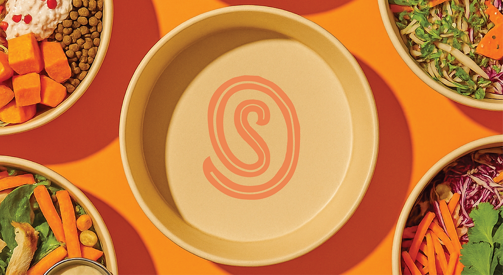
Coining the name ‘Society of Salad’
One community, one passion, one motive- where everyone celebrates clean eating.
“Society” brings warmth, community, and inclusivity.
“Salad” roots it in nourishment, customisation, and freshness.

Logo Design
The branding was crafted to feel fresh, friendly, and full of personality - just like the food it represents. We chose Citrus Gothic Inline for the logotype because of its rugged and fresh energy; it’s bold yet breezy, capturing a sense of originality and joy.


Every detail in the typography holds meaning: leafy flourishes in the ‘S’ and ‘A’ aren’t just decorative, they
symbolise nature, life, and growth. Slightly modified curves add a playful character, while all-caps headlines lend clarity and structure.

Typography
Citrus Gothic Inline was chosen for its bold, breezy character, bringing originality and energy to the headlines and logotype. Paired with the clean, modern Brinnan for body copy, the typography strikes a balance between personality and everyday readability.
Citrus Gothic Inline
A B C D E F G H I J K L M N O P Q R S T U V W X Y Z
BRINNAN
Aa Bb Cc Dd Ee Ff Gg Hh Ii Jj Kk Ll Mm Nn Oo Pp Qq Rr Ss Tt Uu Vv Ww Xx Yy Zz
Colour Palette
Colour choices were equally intentional. A grounding cream anchors the palette, while orange brings appetite, joy, and warmth. Light and dark greens evoke freshness and health; yellow infuses cheer; and purple, used sparingly, adds contrast and a hint of quirk. Together, the colours feel earthy, energetic, and fun as if mirroring the spirit of the brand and the people it brings together.


Iconography

Packaging


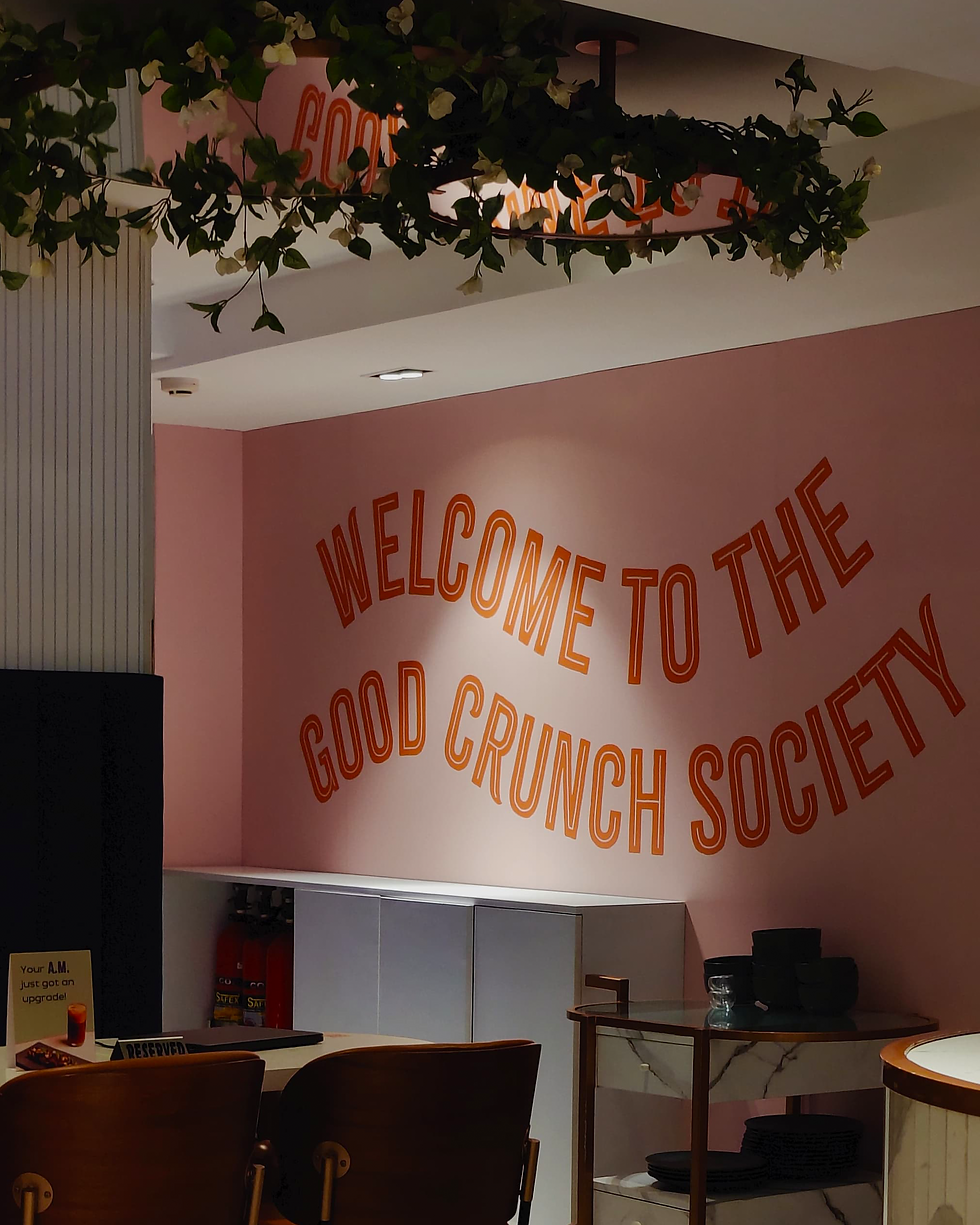
Space Branding


Social Media
Welcome to the freshest club in town
Welcome to the freshest club in town